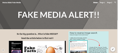
Today we took an in-depth look into Google sites and the sites we had already created. It was cool to see the different styles teachers had come up with to help navigate the sites, but also to make the sites visually appealing. This gave me a few ideas and I decided to make a personal site around having all my school mahi in one place. I've created the framework for my site and moving forward I will be aiming to finish my site off before the end of this year (if I manage to find some time to complete it). We also had a look into a class site that was already established (my teams Health and PE site). We were looking at the set up of the site, what was done well and how we could improve our site. After reviewing the site, I set a goal to make the site easier to navigate and improve the visuals on the site. To achieve this, I moved up our sub page tab (it was close to the bottom and wanted it to be one of the main points to the site), Changed the banner background (we didn't have a banner originally, so changed this to an image relevan tot our subject area) and made our first blog easier to understand while also pointing out the key pieces of information (I cut some of the not so important text out, moved some of the text to relevant positions, underlined, increased the size and made bold the words we really needed our viewers to see).
Once I achieved my goal, I realised how such little changes can actually make a pretty big impact on the navigation of the site. It looks a little better, but the things our students really need to see and comprehend
are easier to find. Here is the finished product to my updated site!


